Northwind Legal
Law firm for small businesses#1F4E79#D4A72CManropeIBM Plex Mono
Voice: clear, direct, supportive, practical. Avoids legalese.
Tagline: “Clear counsel, on your side.”
Brand identity generator
Huecraft turns a short brief into a working brand system: a logo suite, a color palette with its contrast proved, type, voice and a brand guide you can hand to anyone. One pass, not three tools stitched together.
Free plan: one brand kit a month, logo SVG, palette, type pairing and voice statement. No card.

Real kit: Northwind Legal, a sample brand built from one short brief. 449 files in all. Sample, not a customer.
What's actually in your kit
Most AI design tools hand you a wordmark and a PNG, then wish you luck with the rest. Every Huecraft kit has these parts, built from one brief.
Horizontal, stacked, mark and monogram, each in light, dark and mono versions, as SVG and PNG at 1x to 3x, plus favicons, app icons and a web manifest.
Logo concept marks drawn from the name alone are coming soon; today's generated kits ship a wordmark lockup, and Studio builds the suite from a mark you upload.

A primary, an accent and neutrals, each with tints, shades, RGB, CMYK and the text color that works on it. Every pair is measured against WCAG and written into a contrast table, so nobody has to guess.
Sample ramp from the Northwind Legal kit:
| Pair | Ratio | AA |
|---|---|---|
| text on bg | 17.48:1 | pass |
| text on surface | 16.01:1 | pass |
| text-muted on bg | 5.01:1 | pass |
| brand-text on bg | 8.66:1 | pass |
| accent-text on bg | 4.55:1 | pass |
| on-brand on brand | 8.66:1 | pass |
| on-accent on accent | 7.79:1 | pass |
| border on bg | 1.45:1 | pass |
| success on bg | 4.66:1 | pass |
| warning on bg | 4.52:1 | pass |
| danger on bg | 4.83:1 | pass |
| info on bg | 8.66:1 | pass |
A display face and a body face with a licence note, a type scale from caption to display, CSS, tokens and a specimen page. Open-licence fonts ship in the kit, so the files work offline.
A tone statement, traits, do's and don'ts and tagline options, so the words match the look. The voice guide ships as a document your writers can open.
Kettle & Kiln
Tone: warm, direct, down-to-earth, encouraging.
Tagline: “Mud on your hands, mug on your shelf.”
From a real engine run (labelled sample brand).
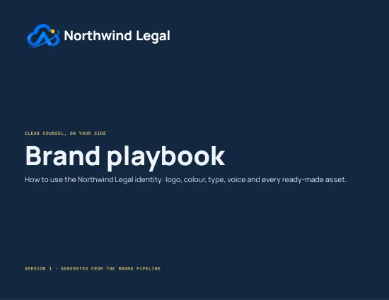
A downloadable PDF with the logo rules, palette, type, voice and applied examples. Studio builds go further: a 16-page playbook and a one-page brand card.
Hosted delivery from our file store is coming soon; today the PDF renders on request from your kit.
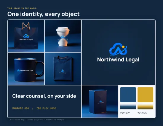
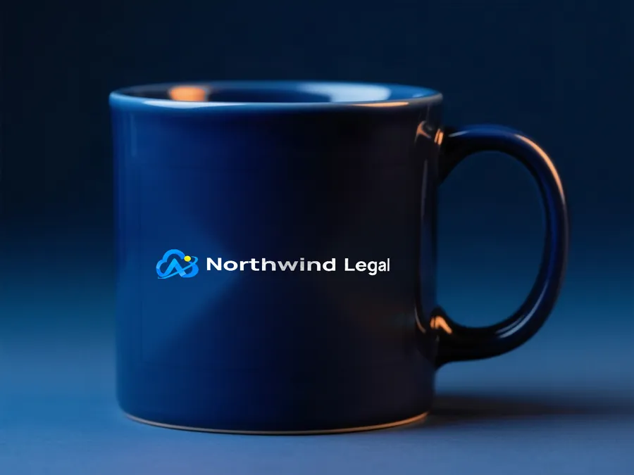
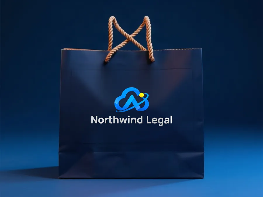
App icon, sticker, pattern, notepad, business card, coffee cup, shopping bag and packaging box, rendered from your logo on request. Studio adds brand scenes and print collateral at full bleed.
Contrast, proved
The same arithmetic runs inside every kit. Try the pair you were about to use on your site.
WCAG 2.2 asks for 4.5:1 on normal text and 3:1 on large text (24px, or 19px bold) and interface parts. Our own Pencil grey fails on paper, which is why this site only uses it for decoration.
Hello, my name is Huecraft.
Body text at this size needs 4.5:1. Large headings and buttons need 3:1.
Not a mock-up
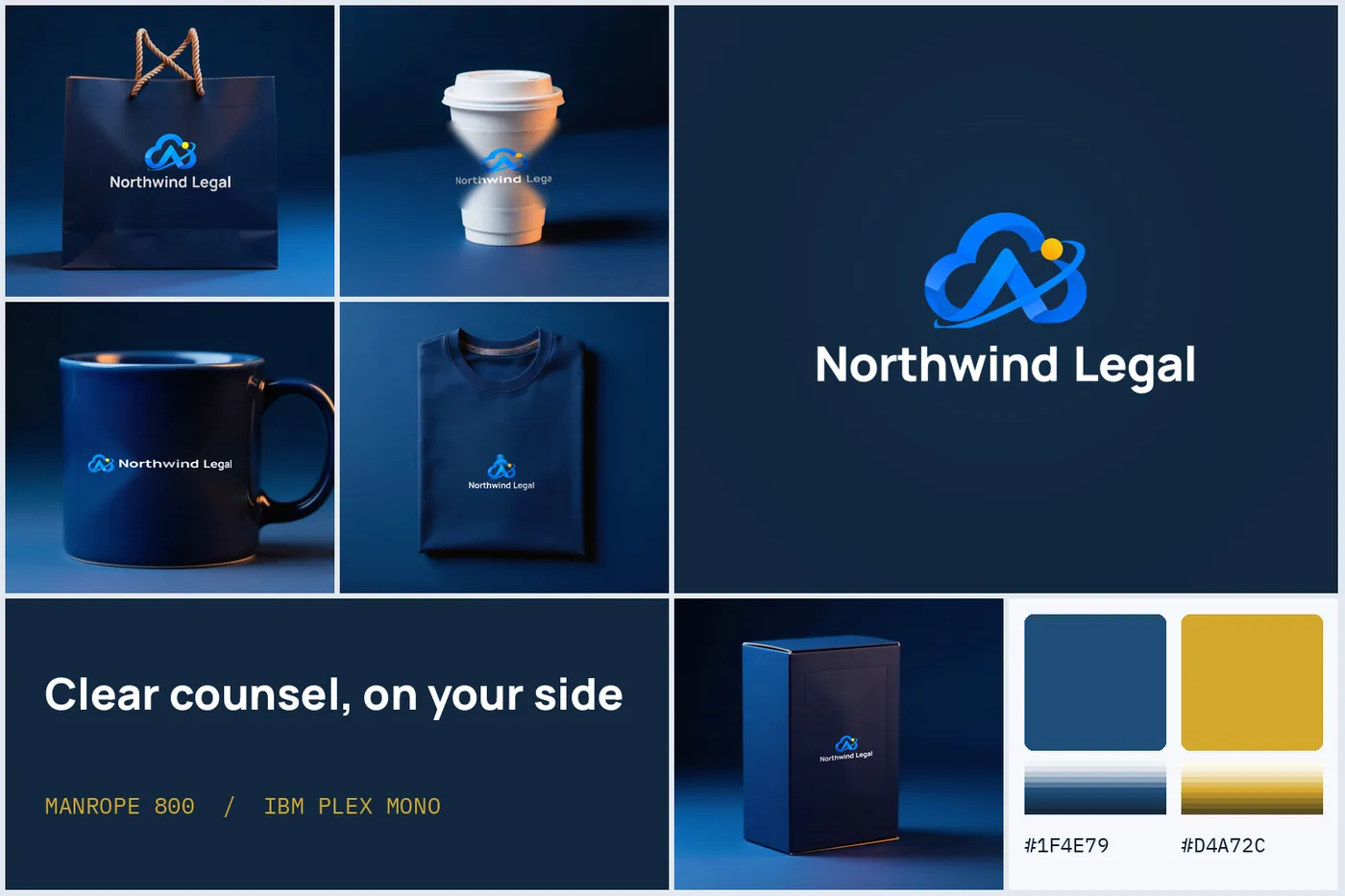
Northwind Legal is a sample brand we ran through Studio to test the pipeline: 449 files from one brief and one uploaded mark. Nothing below was retouched.
Sample brand. Northwind Legal is not a client; the brief was written to exercise the engine.
Same engine
The engine reads the brief. A law firm and a pottery studio get different type, different color math and a different voice, from the same twelve-part structure.
Voice: clear, direct, supportive, practical. Avoids legalese.
Tagline: “Clear counsel, on your side.”
Voice: warm, direct, down-to-earth, encouraging.
Tagline: “Mud on your hands, mug on your shelf.”
Kettle & Kiln
Color and type stages built; the logo suite for this sample is still queued, so there is no card to show yet. We don't fake one.
Both are sample brands written to test the engine.
Studio, for teams and agencies
Workspaces with owner, admin, editor and viewer roles. Invite by email, request approval on each brand element, and build the whole file set in one job: 18 element types from color tokens to trade-show print.
See StudioApprove or request changes per element, with the file hash recorded.
Invite, change roles, remove. Invites accept by link.
Queue a build and watch 18 elements land: logo suite, color, type, tokens, social kit, print, office templates, playbook, hub site, scenes, visuals, newsletter, cover research and a ZIP of everything.
Questions
No. A kit has twelve parts: logo suite, color system with contrast proof, type system, voice, applied assets, a brand guide and more. The logo is one part. Today's generated kits ship a wordmark lockup; concept marks drawn from the name alone are coming soon, and Studio builds a full suite from a mark you upload.
It runs as a background job. You get a job id, a progress figure and a stage name, and the kit lands in your workspace when it is done. We don't quote a fixed number of seconds because it depends on the brief and the queue.
Yes. Each generation is a separate kit in your history. The compare tool takes an alternative logo file and scores it against your current one, with a written brief of the differences.
Yes. Every kit's color system records the WCAG ratio of each text-on-background pair, with pass or fail at 4.5:1. An automated gate that blocks a failing palette before it reaches you is coming soon.
Logo concept marks from the name, the automated contrast gate on generated kits, and hosted PDF delivery from our file store. Everything else on this site is live today.
Free plan, one kit a month, no card. Upgrade when the kit earns it.